 http://billmoyers.com/static/winner-take-all-infographic/chart.png
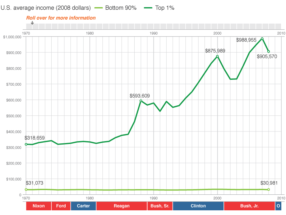
That flat, light green line is the average income for the bottom 99% of Americans. It was $31,073.00 in 1970. Today is stands at $30,091.00, a decline of 3%.
The bright green line represents the upper 1%. In 1970 the average income for those folks was $318,659.00. Today it stands at $905,570.00, an increase of 284%.
And remember in November, todays entire slate of Republican candidates want to give further breaks to the upper 1% at the expense of the 99%.


No comments:
Post a Comment